Thursday, 22 January 2015
Rough Edit
Here is my Rough Edit of 'The Fear'. The transitions between shots are a little jumpy - this will be sorted out before the final cut is made.
Wednesday, 21 January 2015
Editing Process Update

Here is a screenshot of my Editing Process so far. I have now filmed Flora's dancing. I am needing to create a merge or split screen between the two contrasting events. The dancer is in black and white to create a contrast between the two stories. The simplicity of the black and white and the normality of the set against the surreal theme with the bright colors contrast heavily and represent the hyperreality of the meaning within the song.
Feedback so far
I have shown my first Rough Edit to a small audience and received some feedback:
- Some of the lip-syncing is slightly out of sync
- The length of a few shots are too long - vary shots
- Repeat images on the chorus - ongoing theme
- Story/Dancing contrast implied more
- Make sure all shots are in focus
How will I fix these issues?
-> In order to sort out the lip-syncing, I will edit a few of the shots in order to get it in better time
-> I will vary the shots more, in order to be more interesting for the audience
-> The chorus shots need to be linked to each other - ongoing theme (same shot twice)
-> Create a split screen between the dance and the lip-syncing to portray contrast
-> Edit out the out-of-focus shots, replace with a varied shot
Tuesday, 20 January 2015
Ancillary Task - Point 4

Lily Allen's Album Cover for 'It's Not Me, It's You'
This Album Cover is simple, as Lily Allen is laid across a giant 'L' - standing for 'Lily'. This is representing the fact that she is her own person from within and that nobody can control her. The pink theme to the cover is showing that she can be who she likes, as pink is a very bright and innocent color. Lily's star image of being herself and her own person is very much represented in this.

Jason Derulo's Album Cover for 'Tattoos'
The irony of this Album Cover for 'Tattoos' is obvious as it is a painting of Jason Derulo covered in tattoos. The fact his face is a painting represents his opinion of tattoos as being art. The 'Parental Advisory' logo in the bottom right hand corner is necessary for an album which could contain innapropriate or explicit content. The colors are attractive to the eye - creating an appeal to the CD cover.
Derulo's star image is how he see's himself - and to have a painting of himself as the album cover represents this.
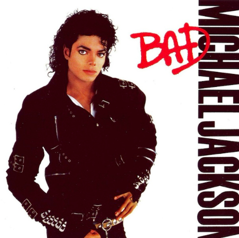
Michael Jackson's Album Cover for 'Bad'
This is a very effective album cover as the simplicity is everything. The font of 'Bad' is spray painted on - graffiti is seen as a 'bad' thing, which is ironic as it is also in red. The serious look on Jackson's face represents the name of the song.
Michael Jackson's star image was strong and varied - he was never just tied down to one theme.

Rihanna's Album Cover for 'Right Now'
This is a very provocative album cover as it Rihanna is posing naked with nothing but a leather jacket covering her chest. This is eye-catching and makes people more interested in the album.
Rihanna's star image is also varied - constantly changing.
Star Image is very important when it comes to selling a new product - particularly with music. The more interesting the music video or the album cover - the more hits it will get.
Ancillary Task - Point 3
Digipak:


The Digipak is the style of the CD/DVD packaging - usually has a registered trademark on in order to indicate where the contents of the CD/DVD was produced. The Digipak can also contain information about the tracks inside - or for a DVD, gives a little information about the content of the film. The Digipak also contains the album cover photo which is a large element of what makes the CD sell.
CD case:
The CD case is the style of case in which the digipak is put into. The digipak is the information - but the CD case (or DVD case) is where it is held. Here is a picture of a standard CD case - depending on the budget of the making of the CD, quality of materials vary.
Ancillary Task - Point 2

Here I have experimented with various fonts which may feature on my Digipack and advert. I feel that the second font down - 'Apple Chancery' is the most effective for the Advertisement and the second font up 'Thonburi' would be most effective for the digipack. As I begin to experiment more it will become clear as to which font will suit this task best.
Ancillary Task - Point 1

Lily Allen's image has played a huge role on how she is seen by her fans and people viewing her videos. Her edgy look attracts certain audience members as she manages to defeat the mainstream looks however get away with it.

Here is Lily Allen's advertisement for her new song 'Sheezus'. The font for 'Lily Allen' is a simple print - in yellow. The yellow matches the shoes she is wearing, representing a 'Gold' type feel. She also wears chains in her hair and has gold featured around her outfit. The blue font for 'Sheezus' color co-ordinates with the blue in her dress, highlighted into her hair and the backdrop.
Monday, 12 January 2015
Blog Update: Editing Process

I have filmed the lip-syncing side of the video. I only had one chance to film Bea and we got all the necessary shots done, as well as extra shots to be safe. I have yet to film Flora dancing, which has been arranged. The shots which are plain black are the parts Flora's dancing will fill in. I am now in the editing process, using iMovie to finalise it. The original song contains explicit content - however has been edited out of the soundtrack.
Subscribe to:
Posts (Atom)