Saturday, 14 March 2015
Thursday, 12 March 2015
Evaluation Task - Point 4
What Technologies did I use?
Firstly, I used a Fujifilm HD film camera to film my video. This was an effective piece of equiptment as my shots were taken in a good quality way.
Secondly, I uploaded my shots onto my MacBook Air.
Thirdly, I used iMovie to edit my shots, this had it's advantages and disadvantages. As it as editing software installed automatically onto my laptop there were many effects I couldn't do. For example, I was hoping to have a split-screen to show the connection between both my actress and the dancer. This was not possible, however the connection was as clearly made as possible.
Fourthly, I used a mixture of Microsoft Word and Photoshop to make my final digipak. I used Photoshop in order to get the colors to suit the pastel theme, but I used Microsoft Word to make the writing colors match the colorscheme. I also used these programmes to make my Advertisement Task.
Fifthly, I uploaded my video to YouTube and shared it to Facebook, as well as my Digipak and Advertisement to gain views and audience feedback. I have now received 466 YouTube viewings on my video.
Evaluation Task - Point 3 - Audience Feedback

Here is my initial audience feedback. I have mainly received positive feedback, talking about the effort I have put into it showing, as the shots were all specifically planned out.
Wednesday, 11 March 2015
Evaluation Task - Point 2 - Linking Themes


Here are a bunch of Screenshots of my Prezi to show the links and connections between my ancillary tasks and my main video. It is important to advertise the video in a way which compliments the video.
Saturday, 7 March 2015
Evaluation Task - Point 1

Here is a 3x3 grid of screenshots of my Music Video. It is similar to some 'real' videos in a few ways
Starting from top left and going right:
1. Product Placement by having a Porsche in the foreground of the shot and the actress in the background.
2. Having a mask to create 'surrealism'
3. Having a large house as well as the Porsche for product placement is a representation of the reflection of the name of the song 'The Fear'.
4. Looking in the mirror and 'reflecting' is commonly used as an effective shot in media.
5. Walking away and throwing up arms is also used as a way of showing the actress has 'had enough' of 'The Fear'.
6. The actress is sitting in a set. I set up my room at home to be pink and red, as well as having a leopard print onesie and a fluffy teddy bear - very cliche.
7. Many 'real' videos have a theme or an object representing the video, I have decided to have a Dream Catcher in order to portray 'The Fear'.
8. Many 'real' videos have dancers to portray the actress' inner emotions through movement. My dancer is throwing herself and bending in different directions, representing 'The Fear'.
9. It is a common stereotype that too many things have been labelled as 'Parental Advisory: Explicit Content'. This is living out the stereotype - the sign is ripped up later on in the video.
Friday, 6 March 2015

Thursday, 5 March 2015

Monday, 2 March 2015
Mock up Advertisement

Here is my mock advertisement. I have kept the 'dreamcatcher' theme as well as a similar color scheme to my final digipak. I contrasted it with black in order to make the pastel colors stand out.
Importance of Print Adverts
Having a Print Advert increases publication of the artist. Something visual to look at attracts attention to the artist and the event being advertised. Having a specific advert for certain events brands the event. It is important to have adverts to raise awareness otherwise nobody will find out about the artist, or the event.

Friday, 27 February 2015
Copied Advertisement - Adele 21

Here is Adele's advertisement for 21

Here is my copied version of Adele's advertisement for 2. I used Microsoft Word in order to create this.
I chose Adele's '21' advert to look at as an example as it is simple yet has a lot of information on it. It advertises that it is available everywhere as well as exploiting how well it has done by winning a 'Grammy Award'.
Wednesday, 25 February 2015
Ancillary Task - Point 9 - Audience Feedback for Mock Digipak

Here is my mock Digipak
I have shown the mockup of my digipak to a selected audience and received some useful feedback

Here is my first piece of audience feedback, from this I can see from another perspective how I can improve the look of the digipak. Particularly, match the second picture better with the rest.

Here is my second piece of audience feedback, from a friend of mine who is also showing it around with her friends. This is more of a complimentary piece of feedback as opposed to anything needing changed.

Here is a very useful piece of audience feedback

Here is another complimentary piece of audience feedback for my mock digipak.

Here is some more audience feedback for my digipak.
Tuesday, 24 February 2015
Monday, 2 February 2015
Ancillary Task - Point 6
Research on how artists make their money nowadays - with the decline in CD sales…
"Instead of receiving a wage from a single employer like most occupations, music artists have what are called income streams."
"Overall UK album sales fell by 11.2% in 2012, according to the British Phonographic Industry (BPI)."
Nowadays, instead of buying the physical CD Album - People choose to purchase they're music online. For example, buying the entire album on Itunes, or downloading illegally. From itunes, the actual artist makes roughly 10% - 40% of the money made - so how else do they make their money?
- Touring
- Merchandise
- Ticket sales
- Sponsers for advertisements
Advertisement for Miley Cyrus' 'Bangerz' tour.
Beyonce merchandise
Ticket Sales
Sponsored advertisements
These are a few of the ways musicians make money these days - they are hugely dependant on funds and hard work in order to continue their income. It is not necessarily talent which helps them succeed now, it is finding the right connections and knowing the right people.
Ancillary Task - Point 5

Here is the original Myloxyloto digipak.

Here is my version of the Myloxyloto digipak. I used Microsoft Word to make it.
Thursday, 22 January 2015
Rough Edit
Here is my Rough Edit of 'The Fear'. The transitions between shots are a little jumpy - this will be sorted out before the final cut is made.
Wednesday, 21 January 2015
Editing Process Update

Here is a screenshot of my Editing Process so far. I have now filmed Flora's dancing. I am needing to create a merge or split screen between the two contrasting events. The dancer is in black and white to create a contrast between the two stories. The simplicity of the black and white and the normality of the set against the surreal theme with the bright colors contrast heavily and represent the hyperreality of the meaning within the song.
Feedback so far
I have shown my first Rough Edit to a small audience and received some feedback:
- Some of the lip-syncing is slightly out of sync
- The length of a few shots are too long - vary shots
- Repeat images on the chorus - ongoing theme
- Story/Dancing contrast implied more
- Make sure all shots are in focus
How will I fix these issues?
-> In order to sort out the lip-syncing, I will edit a few of the shots in order to get it in better time
-> I will vary the shots more, in order to be more interesting for the audience
-> The chorus shots need to be linked to each other - ongoing theme (same shot twice)
-> Create a split screen between the dance and the lip-syncing to portray contrast
-> Edit out the out-of-focus shots, replace with a varied shot
Tuesday, 20 January 2015
Ancillary Task - Point 4

Lily Allen's Album Cover for 'It's Not Me, It's You'
This Album Cover is simple, as Lily Allen is laid across a giant 'L' - standing for 'Lily'. This is representing the fact that she is her own person from within and that nobody can control her. The pink theme to the cover is showing that she can be who she likes, as pink is a very bright and innocent color. Lily's star image of being herself and her own person is very much represented in this.

Jason Derulo's Album Cover for 'Tattoos'
The irony of this Album Cover for 'Tattoos' is obvious as it is a painting of Jason Derulo covered in tattoos. The fact his face is a painting represents his opinion of tattoos as being art. The 'Parental Advisory' logo in the bottom right hand corner is necessary for an album which could contain innapropriate or explicit content. The colors are attractive to the eye - creating an appeal to the CD cover.
Derulo's star image is how he see's himself - and to have a painting of himself as the album cover represents this.
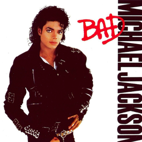
Michael Jackson's Album Cover for 'Bad'
This is a very effective album cover as the simplicity is everything. The font of 'Bad' is spray painted on - graffiti is seen as a 'bad' thing, which is ironic as it is also in red. The serious look on Jackson's face represents the name of the song.
Michael Jackson's star image was strong and varied - he was never just tied down to one theme.

Rihanna's Album Cover for 'Right Now'
This is a very provocative album cover as it Rihanna is posing naked with nothing but a leather jacket covering her chest. This is eye-catching and makes people more interested in the album.
Rihanna's star image is also varied - constantly changing.
Star Image is very important when it comes to selling a new product - particularly with music. The more interesting the music video or the album cover - the more hits it will get.
Ancillary Task - Point 3
Digipak:


The Digipak is the style of the CD/DVD packaging - usually has a registered trademark on in order to indicate where the contents of the CD/DVD was produced. The Digipak can also contain information about the tracks inside - or for a DVD, gives a little information about the content of the film. The Digipak also contains the album cover photo which is a large element of what makes the CD sell.
CD case:
The CD case is the style of case in which the digipak is put into. The digipak is the information - but the CD case (or DVD case) is where it is held. Here is a picture of a standard CD case - depending on the budget of the making of the CD, quality of materials vary.
Ancillary Task - Point 2

Here I have experimented with various fonts which may feature on my Digipack and advert. I feel that the second font down - 'Apple Chancery' is the most effective for the Advertisement and the second font up 'Thonburi' would be most effective for the digipack. As I begin to experiment more it will become clear as to which font will suit this task best.
Ancillary Task - Point 1

Lily Allen's image has played a huge role on how she is seen by her fans and people viewing her videos. Her edgy look attracts certain audience members as she manages to defeat the mainstream looks however get away with it.

Here is Lily Allen's advertisement for her new song 'Sheezus'. The font for 'Lily Allen' is a simple print - in yellow. The yellow matches the shoes she is wearing, representing a 'Gold' type feel. She also wears chains in her hair and has gold featured around her outfit. The blue font for 'Sheezus' color co-ordinates with the blue in her dress, highlighted into her hair and the backdrop.
Monday, 12 January 2015
Blog Update: Editing Process

I have filmed the lip-syncing side of the video. I only had one chance to film Bea and we got all the necessary shots done, as well as extra shots to be safe. I have yet to film Flora dancing, which has been arranged. The shots which are plain black are the parts Flora's dancing will fill in. I am now in the editing process, using iMovie to finalise it. The original song contains explicit content - however has been edited out of the soundtrack.
Subscribe to:
Posts (Atom)